
Ways of analyze data from Google Forms
- Using the Google Forms Summary tab
- Exporting to Google Sheets for deeper dives
- Visualizing data with Looker Studio for presentation
Publishing your form and collecting responses to it is only the first step in a process. The real value of user-submitted Google Forms content comes from analyzing your data to uncover trends, answer questions, and make informed decisions. Whether you’re a teacher reviewing quiz results or a marketer measuring campaign feedback, the tool you choose changes how quickly and clearly you can turn responses into something you can act on.
Google Forms offers several ways to analyze responses, but the best method depends on what you’re trying to accomplish. You can start with the built-in Summary tab for a quick overview, connect your form to Google Sheets for more detailed analysis, or build interactive dashboards in Looker Studio to share insights with others.
In this guide, we’ll walk through each approach, from basic to advanced, so you can choose the right tool for your needs. If you haven’t created your form yet, check out our guide on how to use Google Forms before diving into response analysis.
1. Using the Google Forms Summary tab
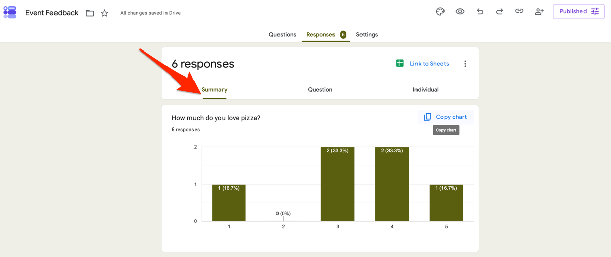
If you’ve already collected responses, the Summary tab is the easiest place to start analyzing them. If you’re not sure where to find or manage your submissions, our guide on how to see responses on Google Forms walks through the Responses tab and its viewing options.
To access the Summary tab, open your Google Form and select Responses at the top of the page. Then click Summary to view an overview of all responses. Depending on your question types, you’ll see visualizations such as bar charts, pie charts, and response totals. For open-ended questions, Google Forms displays individual text responses.
The Summary tab works well for simple tasks, such as checking survey participation, reviewing customer satisfaction scores, or identifying the most common answer to a multiple-choice question. Because the charts update automatically as new responses come in, it’s also a convenient way to monitor results in real time.
The trade-off is that the Summary tab offers only basic analysis. You can’t easily compare responses across multiple questions, apply advanced filters, or uncover deeper relationships in your data. For that, you’ll need to move your responses into Google Sheets.
Pro Tip
For a broader overview of the platform’s reporting capabilities, check out our guide to Google Form analytics.
2. Exporting to Google Sheets for deeper dives
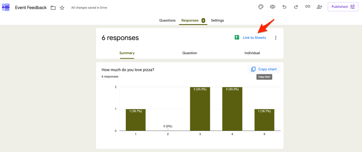
The Google Forms Summary tab is useful for a quick overview, but spreadsheets unlock much more powerful analysis. By linking your form to Google Sheets, you can clean your data, compare responses across questions, identify trends, and build custom reports.
Pro Tip
If you’re looking for a spreadsheet-style workspace that’s built specifically for form submissions, Jotform Tables offers another way to organize and analyze response data.
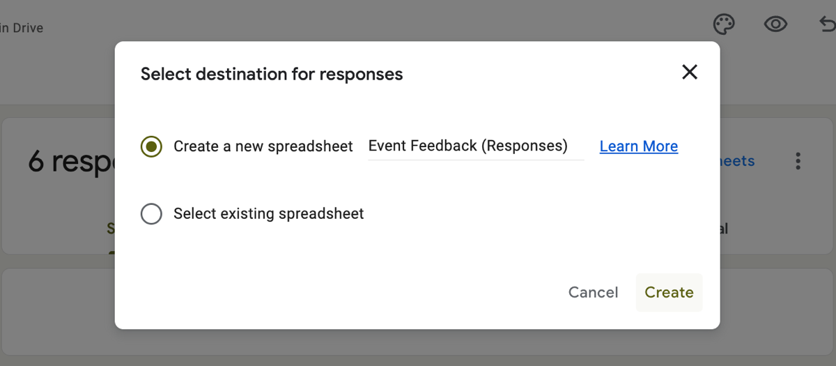
To create or connect a spreadsheet, open your form and select the Responses tab. Click the green Google Sheets icon, then choose whether to create a new spreadsheet or select an existing one. Google Forms will automatically send new responses to the linked sheet, giving you a live dataset to analyze. Our guide on how to create a table from Google Form responses breaks down this setup step by step.
Data cleaning and filtering
Before you start analyzing responses, take a few minutes to clean your data. Removing incomplete or irrelevant entries helps ensure your conclusions are based on accurate information.
Start by freezing the header row so that your column labels remain visible while you scroll:
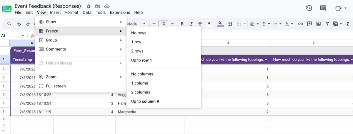
- Open the linked Google Sheet. Select View > Freeze > 1 row.
- Confirm that the column headings stay in place as you scroll.
Next, add filters so that you can sort and narrow your data without changing the original order:
- Select the header row. Choose Data > Create a filter.
- Use the filter arrows to display only the responses you want to review.
For example, you might filter out blank responses, exclude incomplete submissions, or review responses from a specific date range. If you’ve identified obvious spam responses, you can delete those rows before continuing your analysis.
While filters help clean up responses after they’re collected, good form design can reduce cleanup in the first place. Features like conditional logic display only relevant questions, helping respondents complete forms more accurately and reducing unnecessary or incomplete data.
Conditional formatting
Conditional formatting automatically highlights values that match rules you define, making it easier to identify patterns at a glance.
For numeric data, you can apply a color scale to show high and low values:
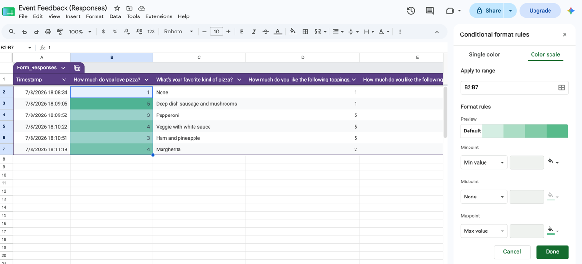
- Select the cells you want to analyze.
- Click Format > Conditional formatting.
- Choose Color scale. Pick a preset color scale or customize the colors to fit your needs.
You can also create rules that highlight specific text. For example, if you’re reviewing customer feedback, you might highlight responses containing words like “excellent,” “refund,” or “support.” This makes it much faster to spot recurring themes without reading every response individually.
Cross-tabulation with pivot tables
Pivot tables help you discover relationships between multiple questions by summarizing large datasets into an easy-to-read format. This is often where the most interesting insights surface. A satisfaction score that looks flat overall might reveal a clear split once you cross-tabulate by region or age group, showing you exactly where to focus follow-up.
For example, you could compare customer satisfaction scores by location, analyze event registrations by department, or see how different age groups answered the same survey question.
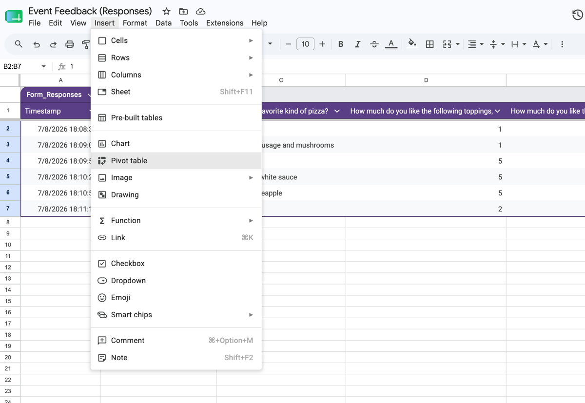
To create a pivot table:
- Select your dataset.
- Click Insert > Pivot table.
- Choose whether to place the pivot table in a new or existing sheet.
- Add fields to the Rows, Columns, and Values sections to summarize your data.
There’s no single “correct” pivot table — your table structure should depend on the questions you’re trying to answer. If you’d like a more detailed walkthrough, see our guide on how to create a pivot table in Google Forms.
Analyze your data with AI
Open-ended responses often contain your most valuable feedback, but they’re also the most time-consuming to review manually.
If your Google Workspace plan includes Gemini features, Google Forms can summarize open-ended responses and identify common themes automatically. This is a quick way to understand qualitative feedback without reading every response individually.
For more advanced analysis, you can also export your responses as a CSV file and upload them to an AI tool. Modern AI assistants can group similar comments into themes, identify common questions or concerns, summarize sentiment, and suggest key takeaways. This approach is especially useful when you’re analyzing hundreds or thousands of free-text responses.
For instance, let’s say you’ve collected hundreds of responses to an open-ended question like “What did you think of the event?” An AI tool can cluster similar complaints or compliments together, flag recurring pain points, and even draft a summary paragraph you can drop straight into a stakeholder report. This turns a task that might take hours of manual reading into a few minutes of review.
3. Visualizing data with Looker Studio for presentation
A spreadsheet full of pivot tables isn’t always the best way to share your findings. If you need to present results to a team, a client, or leadership, Looker Studio is Google’s answer.
Looker Studio is a free, native tool that turns your spreadsheet data into interactive dashboards with charts, graphs, and filters that update automatically. Instead of sending someone a static spreadsheet, you can share a live report that reflects new form responses as they come in.
To get started, connect the Google Sheet linked to your form as a data source in Looker Studio, then choose which columns to visualize as charts, tables, or scorecards. Because the dashboard pulls directly from your sheet, there’s no need to manually refresh or re-export data every time you want an updated view.
That said, Looker Studio does come with a steep learning curve. Every chart requires you to manually map dimensions and metrics, configure data source connections, and troubleshoot formatting issues in ways that aren’t always intuitive for first-time users. For a one-off survey, this setup time can end up outweighing the benefit of an interactive dashboard — especially when all you really wanted was a shareable, presentation-ready report.
Automate your analysis with Jotform Report Builder
Look again at that workflow we just mapped out: Publish a form, link it to Sheets, clean and filter the data, build pivot tables, then rebuild all of it again in Looker Studio to get something presentable. That’s three separate Google tools stitched together, each with its own learning curve, simply to turn responses into a report you can actually share.
Jotform Report Builder collapses that entire workflow into one step. Instead of exporting your data and rebuilding it elsewhere, Jotform takes your raw form submissions and instantly transforms them into polished, presentation-ready slide decks or dashboards — no spreadsheet detour required.
Because there’s no exporting involved, there’s no need to click “Link to Sheets” wrestle with pivot table configuration, or learn Looker Studio’s data source settings. Form data flows straight into visual charts the moment a response comes in.
Reports are also live and shareable. Once your dashboard is built, you can share it with a simple link, and it updates in real time as new submissions arrive. This guarantees that stakeholders always see current data, not a snapshot from last week.
And unlike the Summary tab’s basic charts, Jotform’s reports support genuine interactivity. You can apply dynamic filters on the fly, letting you or anyone you share the report with slice the data by date, category, or response value without touching the underlying form. For instance, if you want to see how satisfaction scores break down by location, you can do it in seconds, directly inside the report — and there’s no need to adjust a formula or rebuild a chart.


Best of all, if you’re already using Google Forms, you don’t have to start from scratch. You can migrate your Google Forms to Jotform with a single click, then let Report Builder instantly turn your responses into actionable insights. Give it a try for free today.
This article is for researchers, marketers, educators, and operations managers who have finished collecting their data and are struggling to find meaningful insights using Google’s default charts.




































































































Send Comment: