
Steps to make a pie chart in Google Forms
- Open Google Forms and select the form
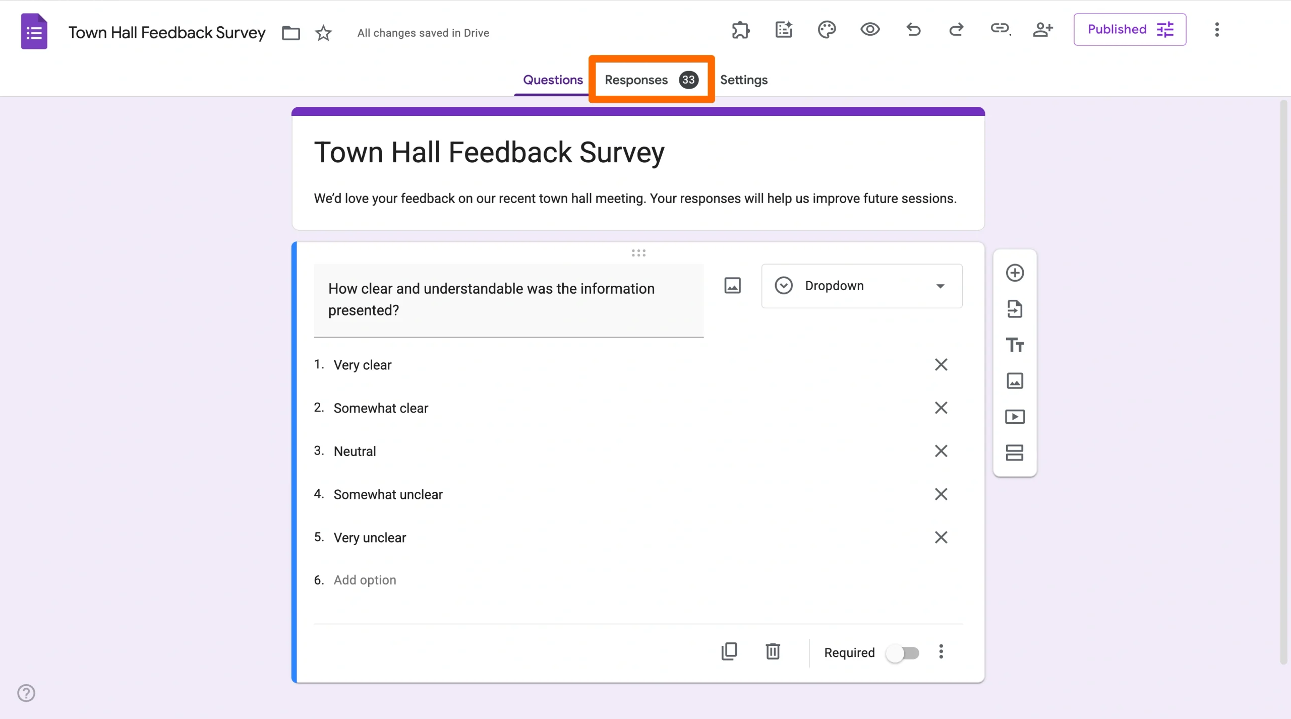
- Click the Responses tab
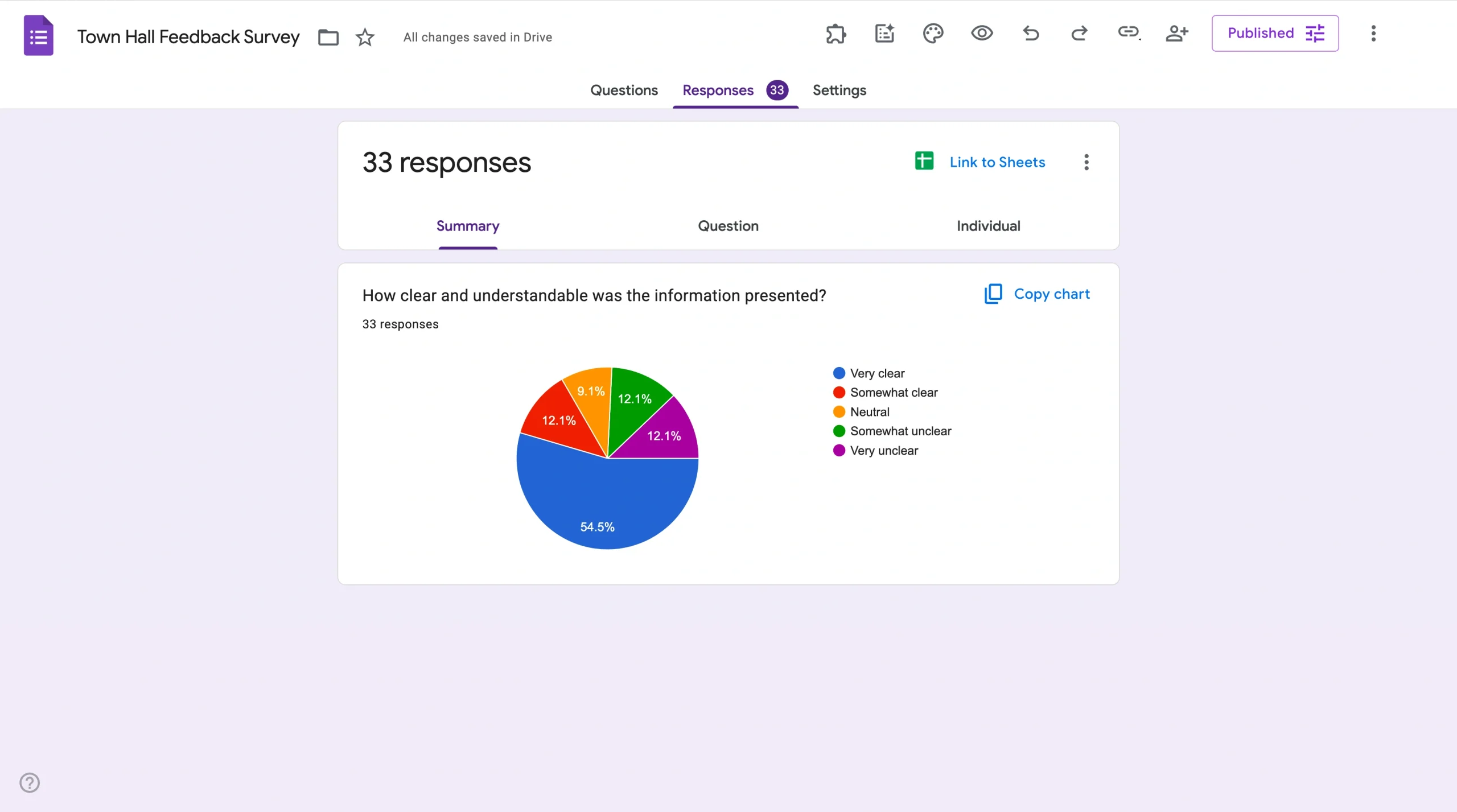
- You’ll now see simple pie charts representing the responses
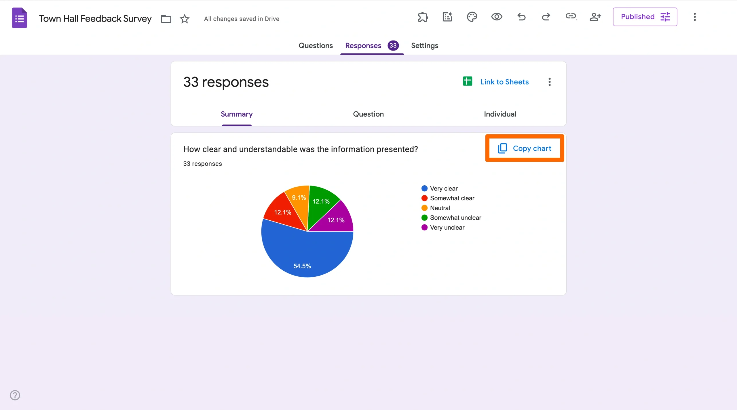
- To share, click Copy and paste the images where you’d like them to appear
Data drives today’s world, whether in making high-level business decisions or selecting where to have dinner. But not everyone is interested in looking at complex spreadsheets and endless numbers.
That’s where data visualization comes in: It’s a powerful way to transform raw data into meaningful insights. One of the most popular and effective ways to visually present data is with pie charts, which provide a clear and concise picture of how a particular data set is distributed.
Whether you’re an administrator analyzing survey responses, a business leader examining customer feedback, or simply someone looking to present information in a visually appealing format, learning how to make a pie chart in Google Forms can help. Read on to learn the step-by-step process for creating informative pie charts with Google Forms, as well as an alternative tool that can help you achieve similar results.


Why pie charts are important
Pie charts have distinct advantages over other data visualization formats:
- They present data simply and clearly. Pie charts are easy to understand, even for people with little or no data analysis experience. They make it immediately apparent how a whole is subdivided into its various components, allowing any audience to quickly grasp the presented data.
- They’re visually appealing. Stakeholders favor pie charts for professional presentations because their colorful segmentation makes data more engaging.
- They enable comparative analysis. With multiple pie charts of the same data sets over time, you can easily compare changes and trends. Pie charts are valuable assets for tracking progress or identifying shifts in data patterns.
- They’re simple to create. With data visualization tools like Google Forms, creating pie charts takes little time and doesn’t require advanced technical skills. This accessibility ensures anyone can generate pie charts to enhance their presentations or reports.

Looking for the best alternative to Google Forms?
Jotform’s full-featured form-building solution is mobile-friendly and has the most integrations in the industry. Use it to collect payments, automate workflows, gather leads, and more.
How to make a pie chart in Google Forms
Now that you understand why pie charts are important, we can cover how to make a pie chart in Google Forms:
- First, open Google Forms and select the form that contains data you want to present. If you don’t yet have a Google Form, you’ll have to create a new one and collect responses.
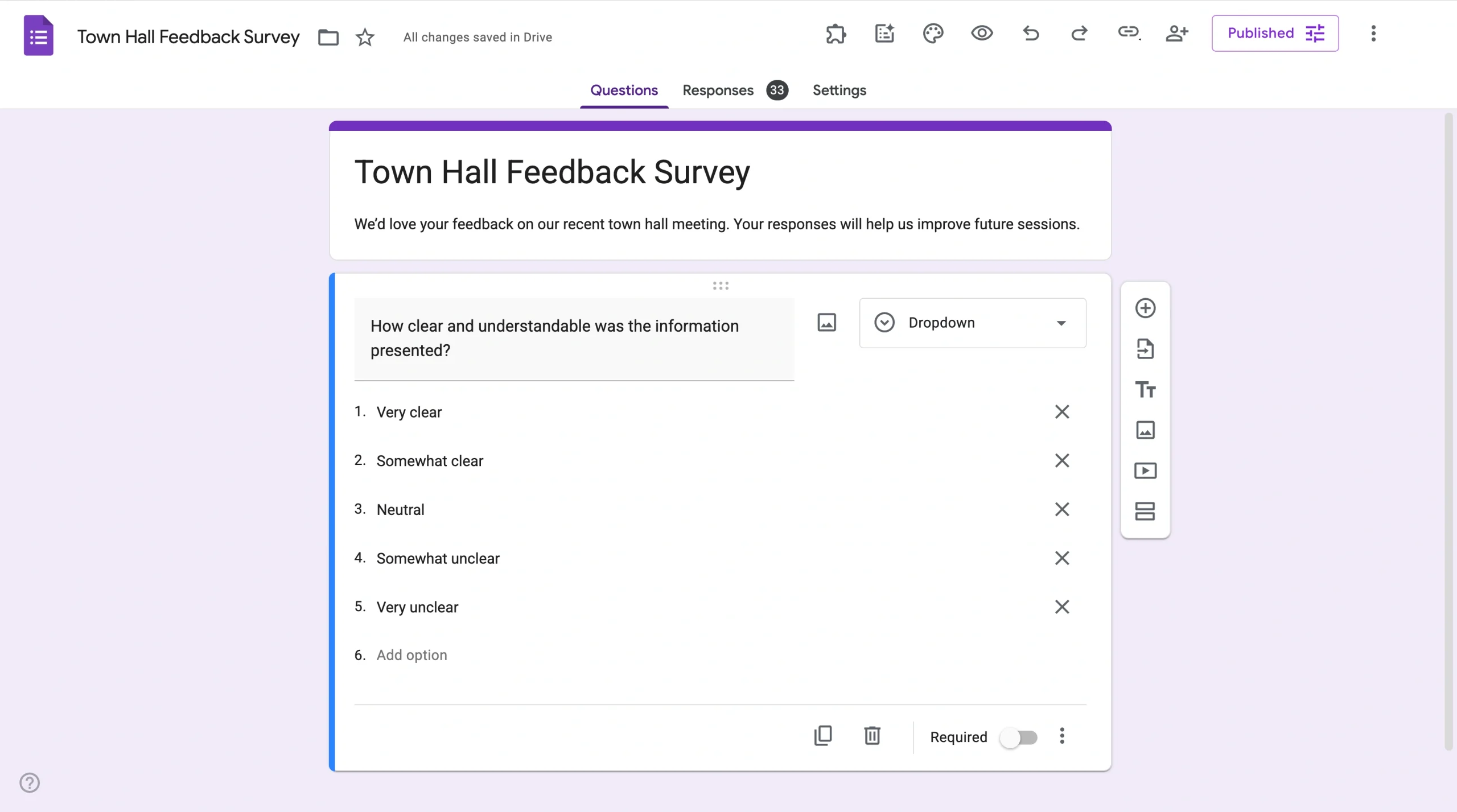
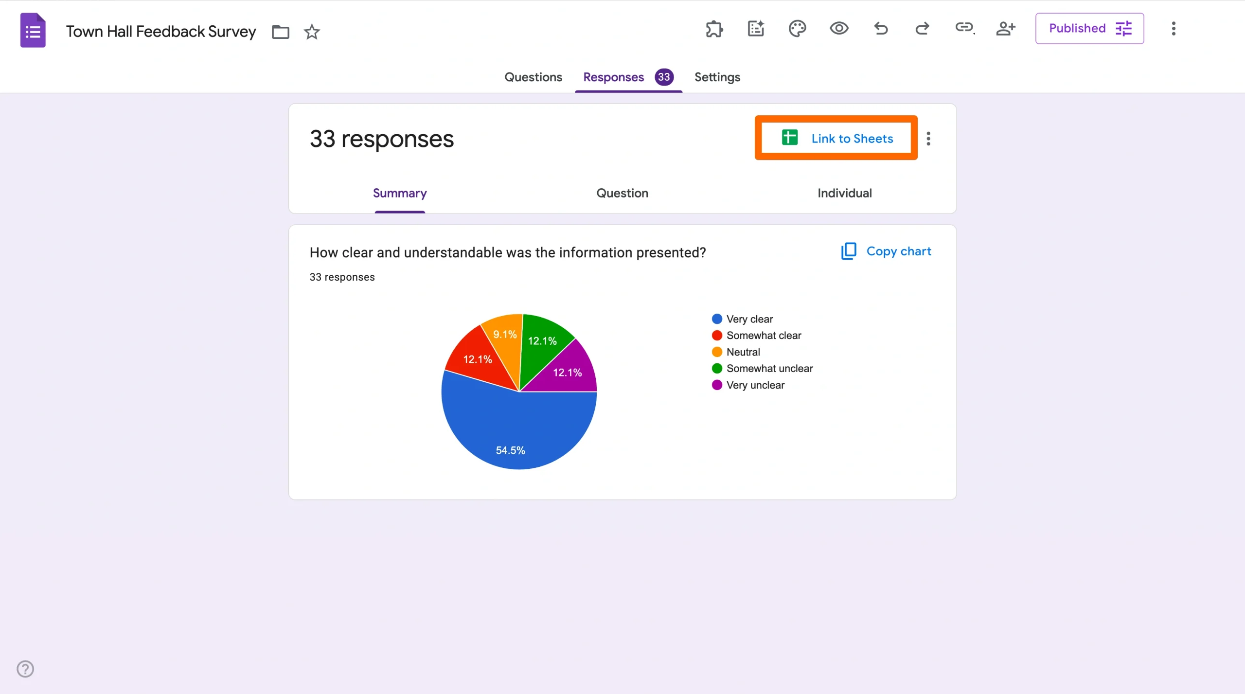
- Next, click the Responses tab.
- You’ll now see simple pie charts representing the responses to each question.
- To share the pie charts, click Copy in the upper left and paste the images where you’d like them to appear.
While this process is straightforward, it doesn’t allow you to customize the chart’s text or design. Plus, you can only share them by copying and pasting the image.
Pro Tip
In the Responses tab, multiple choice and dropdown questions usually appear as pie charts. However, checkbox questions allow multiple selections, so their results are typically shown as a bar chart instead.
How to change pie chart colors in Google Forms
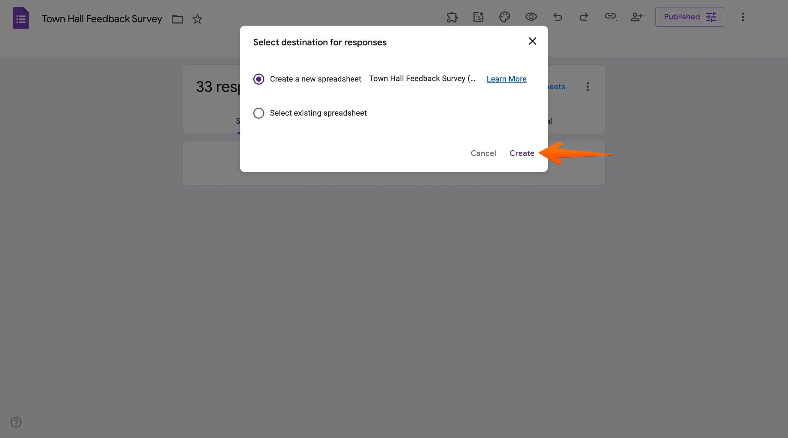
To customize the pie charts further, you’ll have to use Google Sheets. Here’s how to do it:
- In the Responses tab, click the Google Sheets icon to create a linked spreadsheet that will collect form responses.
- Click Create to open a new spreadsheet or open an existing one.
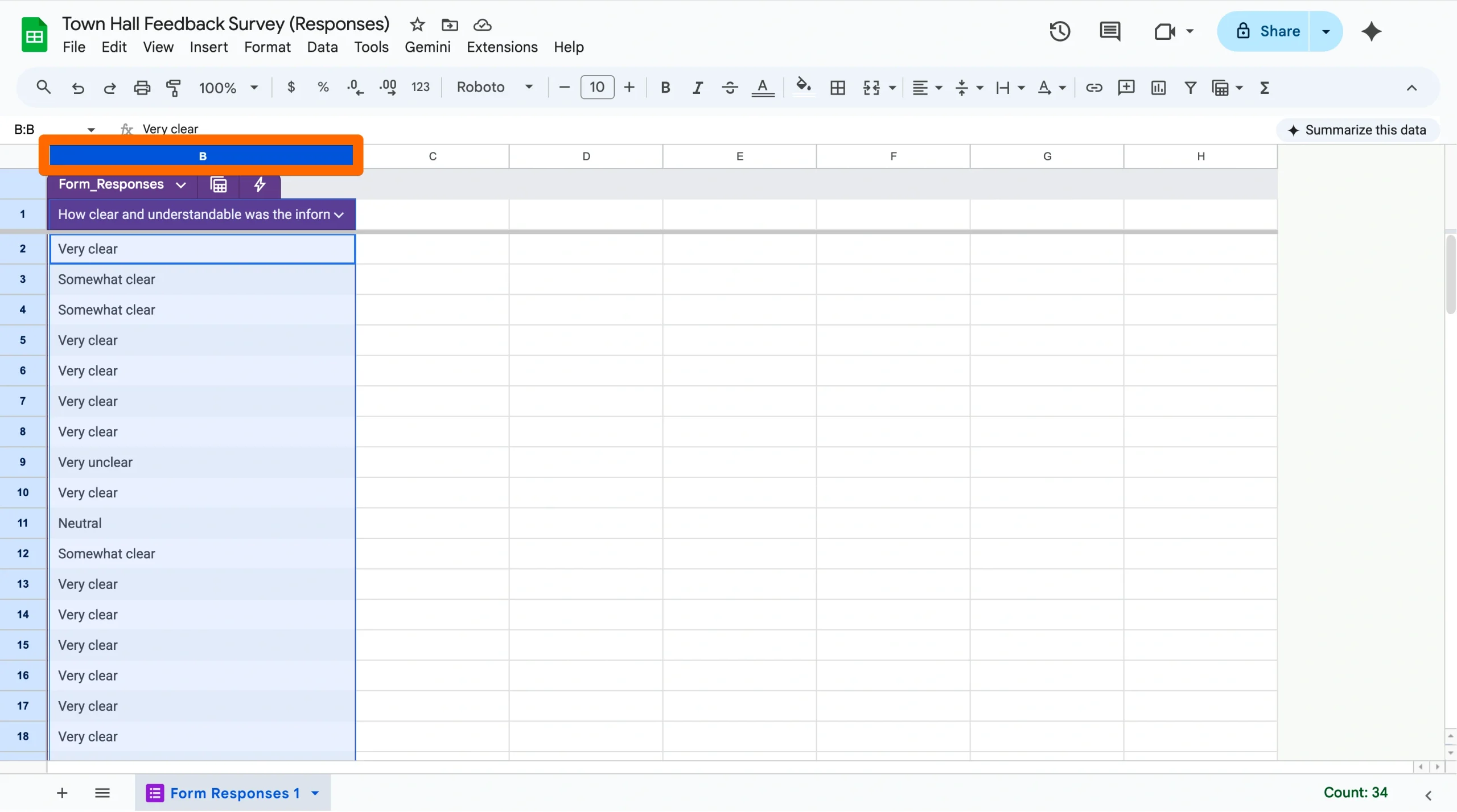
- To create a pie chart, select the data in the column you want to display (including the column label and the data below it).
- Click on the Insert menu and select the Chart option.
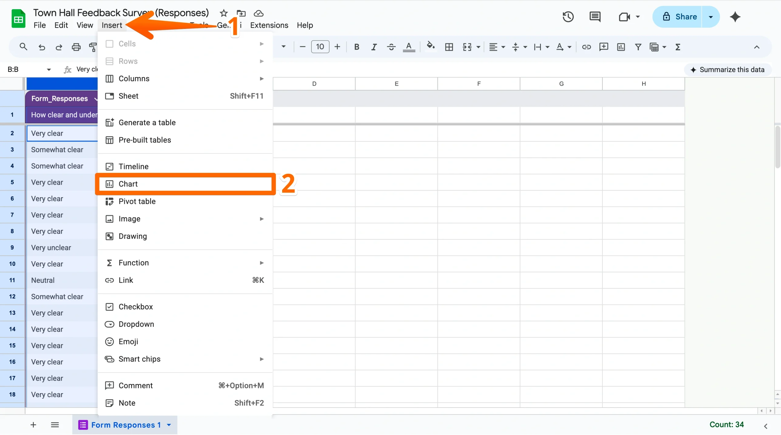
- Select Pie chart as the chart type.
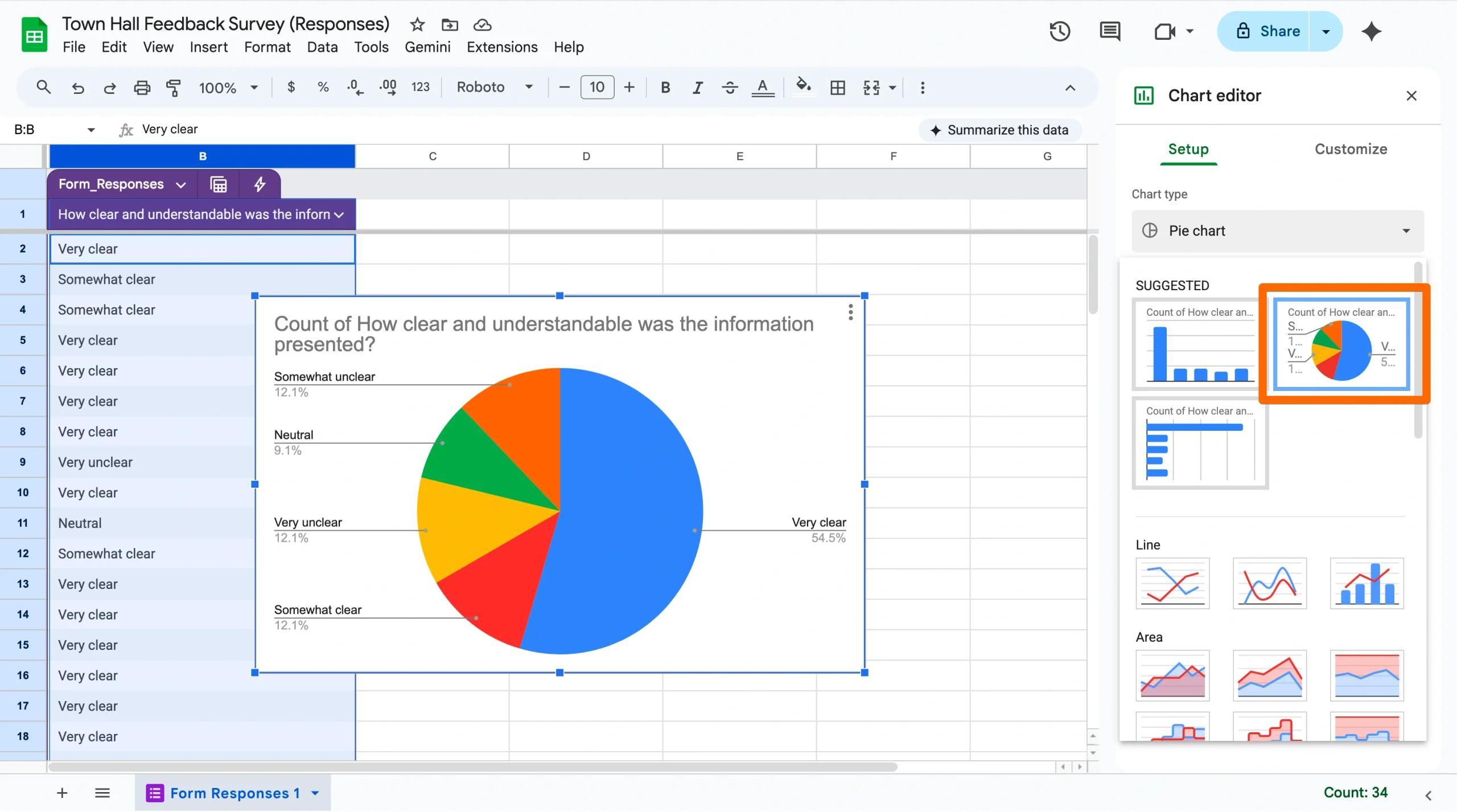
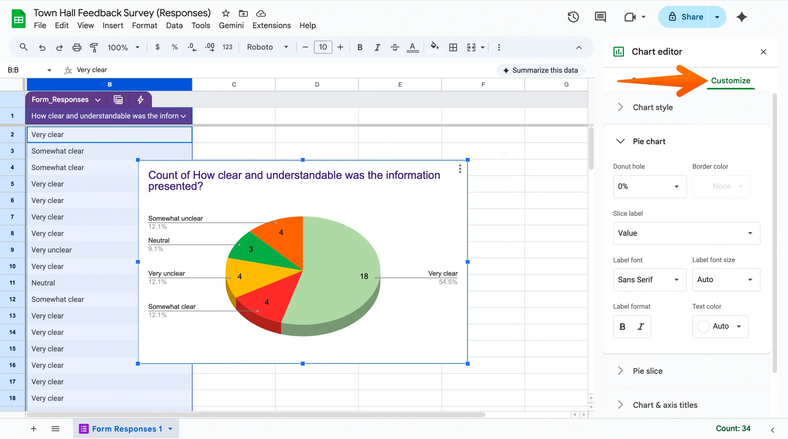
- Customize the chart’s appearance and labels in the chart editor.
Once you’ve created the pie chart in Google Sheets, you can also embed it into a Google Slides presentation, share it as a link, or download it as an image to use in reports or presentations. To see these options, click on the chart, then select the three-dot menu in the top right.
How Jotform makes creating pie charts a piece of cake
Google Forms is one of the most popular online form builders, but it’s not the only free solution for collecting responses and visualizing data. Jotform features a library of over 20,000 fully customizable form templates that help users collect the data they need. What’s more, Jotform features robust data visualization and customization features built into the platform, making it a powerful alternative to Google Forms for building pie charts.
Here’s how to create a pie chart in Jotform:
- Open your form submissions in Jotform Tables.
- Click on the + Add Tab button at the top of the page.
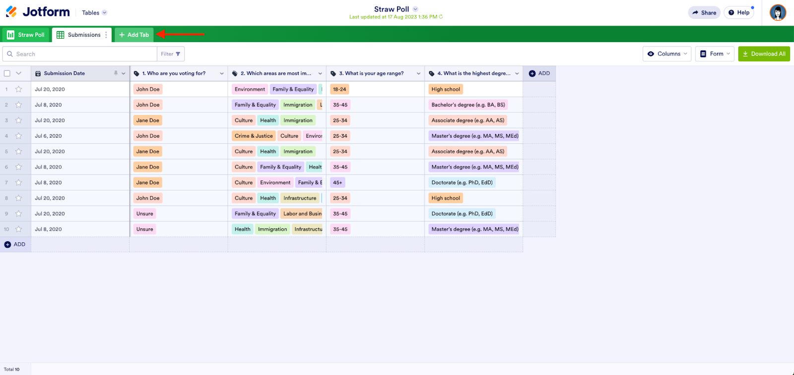
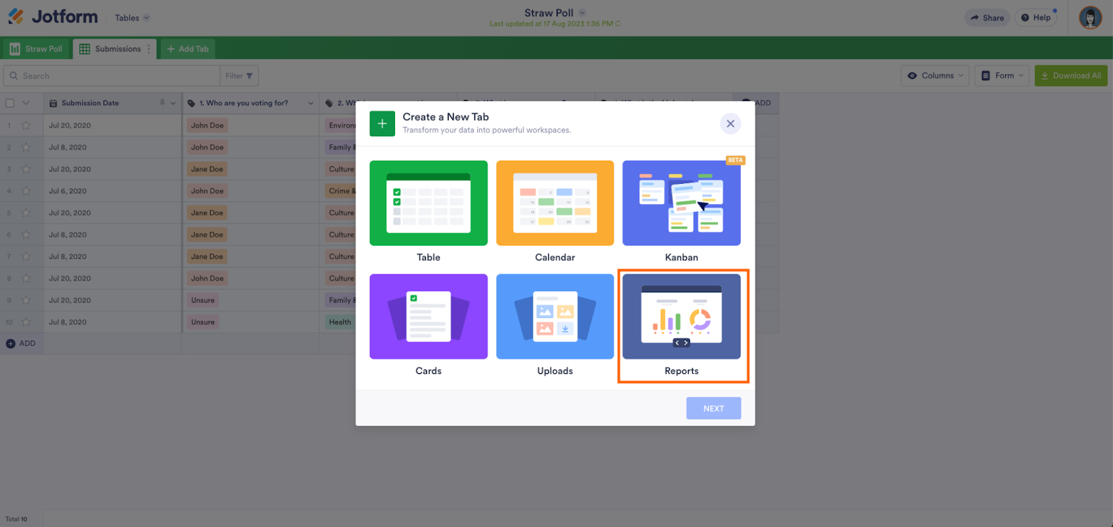
- Click on Reports, and then click the Next button.
- Choose the form you want to show data for, then click the Next button.
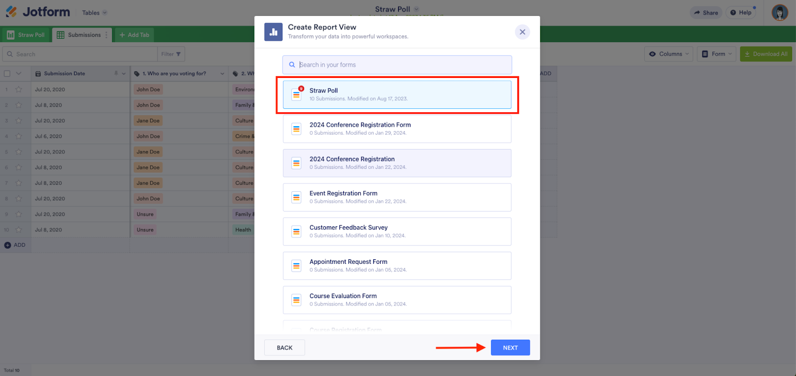
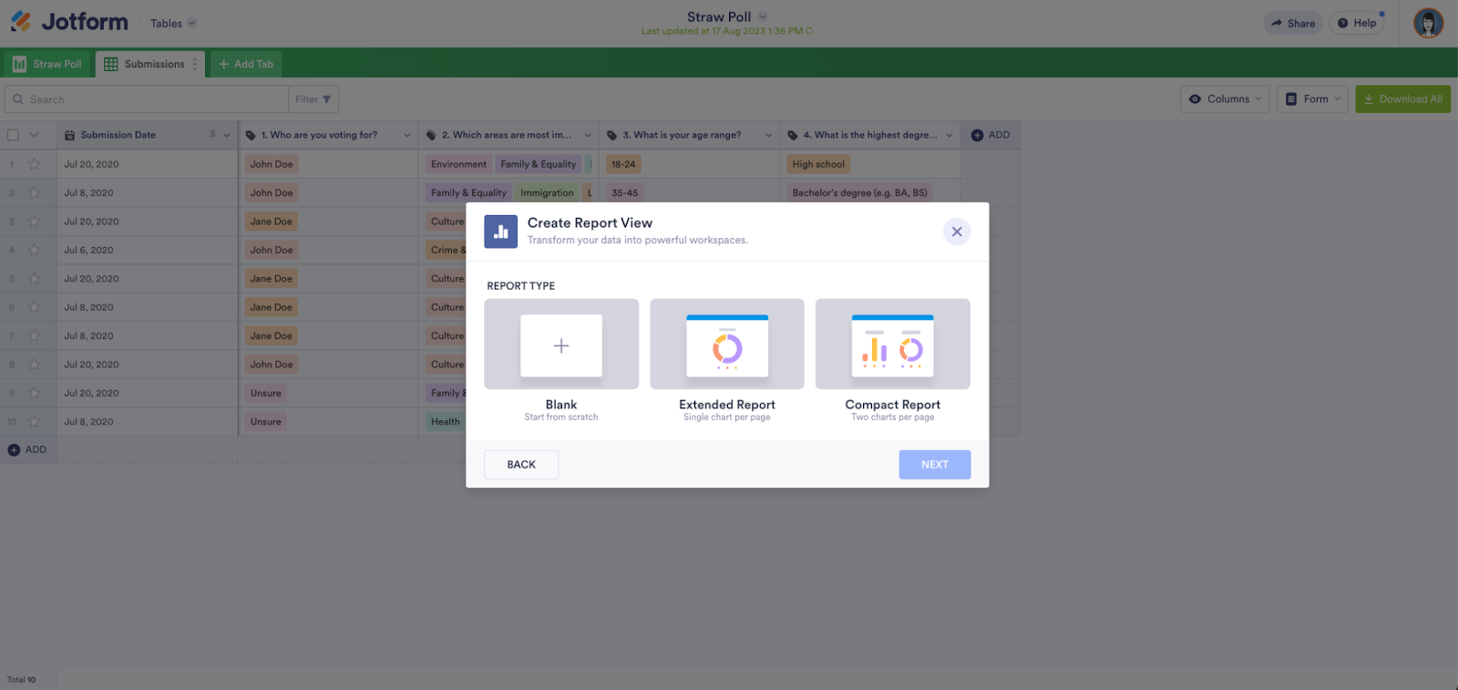
- Select the Report View you want, then click the Next button.
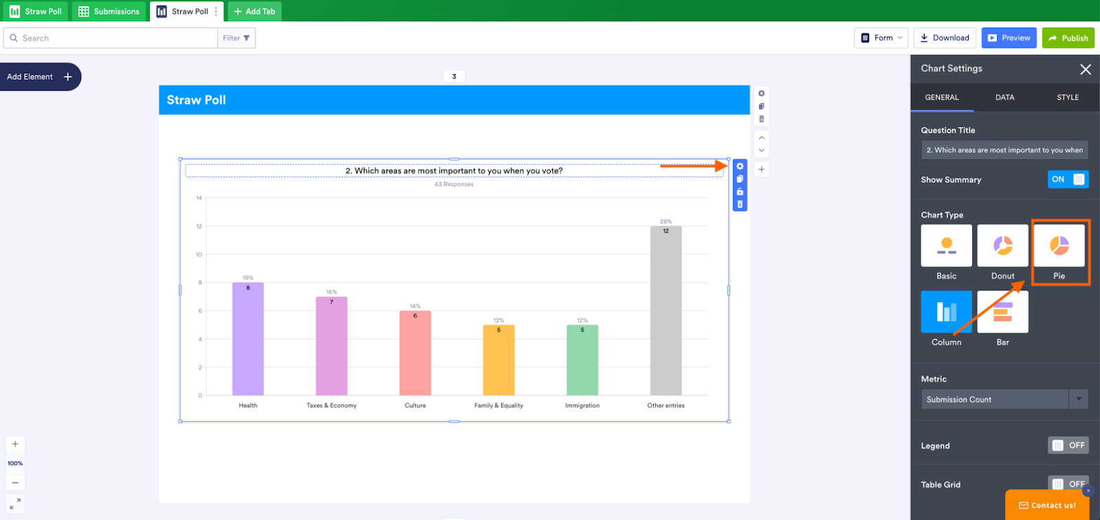
You’ll now see an auto-generated report on all your form submissions represented as charts.
To change any chart into a pie chart, click on it. Then click the gear icon in the upper right to open the chart settings menu. You’ll then be able to select the pie chart format.
Although the pie chart has been around since the 1700s, it remains one of the most effective and engaging formats for data visualization, offering a straightforward and intuitive way to convey complex information. Google Forms is one of the most popular online form builders, but sharing pie charts with this tool can take more time and effort than necessary. For a streamlined way to collect, visualize, and share data, try Jotform.
Photo by Julia Khalimova


Send Comment: