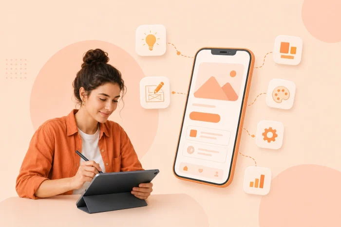
Almost half of all installed apps are uninstalled within the first 30 days — very often on the same day of download. Users simply don’t have the patience to deal with sub-par apps. They’re looking for perfection and nothing else will do.
If you’re designing an app, you’ve got to carefully turn a user’s problem into a clean, easy-to-navigate user experience — with seamless flow, structure, and visual hierarchy. Anything less will end up uninstalled.
In this educational guide, we’ll map out the app design process step by step, from defining the user problem to handing files over to a developer. By the end, you’ll know how to design an app that users love.
Need an app today? Skip the design phase entirely
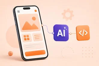
With Jotform AI App Builder, you can simply describe your ideal app with a prompt, and the AI app builder will generate a fully functional, ready-to-deploy app in minutes — no design or coding skills needed. You can then add the finishing touches through additional prompts to ensure the app meets your exact needs.


1. Start with the problem, not the features
The first step, product discovery, is one of the most important parts of the app design process. Consider what problem your app is trying to solve for your target audience. Figure out what kind of frustration or unmet needs your target audience is dealing with, and how you can help.
You’ll need to identify
- The main problem and how users solve it today: What issue leaves your target audience banging their heads against the wall? Is it something they experience daily or only occasionally? Where does the problem take place — at work, home, or on their commute? What types of solutions are they currently using to solve this issue, and why will your app be the better option? Consider what aspect of their current approach causes friction, and how you can make that process easier, smoother, or faster.
- The target audience and what they care about: Who are the primary users you’ll target? Consider the goals they will want to achieve with an app. You’ll also need to understand their level of technical know-how.
- The desired outcome for your target audience: Once they start using your app, what should your target audience be able to do more easily and effectively? Identify the benefits, such as saving time or money, or reducing manual errors.
Be sure to validate your assumptions about the problem and your target audience by doing some research. You can talk to potential users, read customer reviews for similar apps, study competing products, and review search behavior. It’s important to have clear evidence that the problem you’re trying to solve is urgent and important enough to justify a dedicated app solution.
2. Map the user flow and screen list
The next step is to outline how your app will solve the identified problem. Figure out the app’s core task and the shortest, clearest path to carrying it out — starting with the opening screen.
Here’s what you’ll need to do:
- Map the user journey: Write down each action the user has to take, including any decisions they have to make or options they have to choose, in order to complete the core task. You’ll also need to consider what happens before, during, and after the user completes the main task. Are there secondary tasks they’ll need to complete as well?
- Consider variations of the user journey: Will the user be able to enter the journey from different locations, such as through the app home screen or a notification? Will it change the journey in any way? You’ll also need to think about any potential high-priority edge cases that could take place, such as failed subscription payments or loss of an internet connection mid-journey.
- Create a screen list: Identify what each app screen will look like for every step of the user journey, such as login, home, search, results, checkout, and confirmation screens. Consider what information needs to be on each screen in order for users to complete the actions they’re trying to take. Be sure to edit the screen list and remove any unnecessary steps that add friction.
One thing to watch out for in this step is feature creep. Separate must-have features from nice-to-have features, and determine how to make the app efficient and targeted towards your users’ problem. Additional features may seem exciting, but they can add unexpected time, energy, and friction for users. Keep your app focused on the core problem you’re trying to solve.
3. Choose your platform and native design language
Before you get into looking at UX wireframing guides or mobile UI design tutorials, you must choose your platform and native design language. The platform(s) you choose impact how the app will look and behave. And by making that decision now, you can design screens specifically for that platform (or for multiple platforms) instead of creating a generic mobile user interface.
Your options include
- Apple iOS: When designing for Apple, refer to their Human Interface Guidelines and Apple Design Resources — both of which cover areas like layout, navigation, typography, and more. It’s important for your app to feel similar to other Apple apps so that users have a sense of familiarity and comfort with it from the very beginning, especially when it comes to buttons, toggles, menus, and other important navigation features.
- Google Android: If you’re going with the Google ecosystem, check out Google’s Android Design & Plan guidance for the official word on styles, themes, and design resources. Follow Material Design 3 and the established patterns for navigation, buttons, cards, and other important app components. Be sure to plan for adaptive layouts that work on both compact and larger screens.
- Cross-platform app design: If you want to target multiple operating systems rather than designing for only one, you’ll need to determine which parts of the user experience will remain consistent across platforms (such as colors and fonts) and which parts will differ. There may be some platform-specific conventions you’ll have to follow, such as for navigation, controls, and permissions. You’ll also need to consider brand consistency against platform-native familiarity, and determine which aspects need to be platform-specific to ensure users are comfortable with using your app from the start.
Pro Tip
Having trouble deciding which platform to go with? Consider your target audience and whether they’re more likely to prefer a specific platform or live in a geographic area where a platform is more dominant. Also consider your app’s usability beyond phones. Can it be used on watches, tablets, desktops, and other devices? That may also help you decide which platform to build on.
4. Create low-fidelity wireframes
Next, build low-fidelity wireframes — essentially a skeleton of each app screen — based on the screen list you made in step two. Think about what information you need on each screen, where it should go, how a user takes action, and how users move between screens.
We’re not getting into design, imagery, colors, and branding just yet. Right now, your wireframes will have simple grey lines, boxes, and placeholder text. The goal here is to just map layout and functionality and determine how the user will interact with each screen. You’ll have an opportunity to flex your creative muscles in the next steps.
Here’s what to focus on in your low-fidelity wireframes:
- Follow the golden rules of UX: When you look at each screen, users should immediately know the answers to three questions: Where am I? What can I do here? What happens next? If they can’t quickly answer these, the screen isn’t doing its job well enough. Focus on clarity and simplicity above everything else.
- Figure out the best navigation pattern for the app: Most apps have between three and five top-level destinations, such as home, profile, bookings, and search. But how will users move from one app section to the next? And will you place the navigation bar at the top or bottom of the screen? Whatever you decide, ensure you maintain consistency. Google’s Material Design navigation bar guidance is a helpful resource.
- Make tap targets accessible: Have you ever clicked the wrong button in an app because the tap target was too small? It’s incredibly frustrating for users, which is why buttons and other interactive elements need to be large enough to tap accurately. Apple recommends that tap areas be 44 x 44 px while Android recommends 48 x 48 dp. If multiple tap targets are close together, ensure there’s enough room between each target.
Once the wireframes are ready, review them in sequence to make sure users will be able to complete their journey easily. It might be helpful at this step to involve a tester who’s unfamiliar with the app. Have them walk through the wireframes in sequence and point out any areas of confusion.
5. Convert wireframes into a clickable prototype
Before you spend time and resources on a polished visual design, test whether the app flow works the way you envision. You can do this by converting your wireframes into a clickable prototype. This is an interactive model that simulates how a user moves through the app. It doesn’t have any backend functionality or real data; the prototype mimics user interactions and can help you pinpoint confusing user flows before you get into full design or development.
Here’s what to do:
- Link the screens: When creating your mobile app mockup, use Figma app prototyping to connect the screens and build a realistic path that a user would take through the app. Other tools you can try are Sketch and ProtoPie. These tools enable you to connect buttons, cards, and other navigation elements to the appropriate screens so you can see how the user flow works. During this process, you may be tempted to make every element in your wireframe clickable. It’s best to focus on your core user flow first and ensure you get that right before moving on to the secondary elements.
- Put your prototype to the test: Have a few external users who are not familiar with the app test the flow. Give them a specific task to complete within the prototype, such as, “Book an appointment for Wednesday.” Don’t provide any instructions on how to do the task, and monitor how the testers move through the journey on their own. Note areas where they hesitate or make a mistake — these may be areas you need to revise.
Pro Tip
Focus more on your testers’ actions within the prototype rather than what they say about the prototype. For example, some users may say they thought the prototype was easy to use. However, if you noticed that they hesitated when completing actions, it could be because they were momentarily confused about what to do next. You’ll be able to design a more effective app by focusing on user behavior.
Based on how external testers move through the prototype, you may need to update labels, navigation, screen order, and other elements. Once you’ve made the changes, run it by more testers and record their behavior with the prototype. Repeat this process until the prototype provides testers with a smooth journey to complete their task.
6. Apply high-fidelity UI styling
After all the refining and testing, it’s finally time to turn the prototype into a polished, visually appealing user interface that’s detailed enough for a developer to pick up and run with.
This is the stage where you’ll apply the colors, typography, imagery, icons, and visual hierarchy, and follow the platform conventions based on your selection in step three. Above all, ensure the design is consistent on each screen. This will provide users with a streamlined experience no matter which screen they’re on.
Here are some important aspects to keep in mind at this stage:
- Establish your design system: Create visual rules that you’ll apply to different aspects of your app, such as spacing, icon style, color palette, and more. These rules should be well documented so that your developer won’t have to make any assumptions.
- Create a component library: Using standard components for buttons, input fields, headers, tabs, and other recurring elements ensures consistency throughout your app. Figma provides a helpful guide on creating components and their variations. Creating a component library can take time upfront but is well worth doing — it saves a considerable amount of effort and time in the long run.
- Don’t forget about the forgotten states: Not all user paths through the app will be perfect. There will be empty screens (such as when a user has no messages), error states (such as for a failed action), and loading states (such as when users are waiting for the action to complete). These states also need to be considered in design.
As you focus on styling, think about whether your designs are accessible. Look at color contrast, text size, and other indicators that can impact how certain users interact with your app. The Web Content Accessibility Guidelines provide helpful information to ensure your apps work for individuals with a range of needs.
7. Package the design specs for developer handoff
When passing the project files over to the front-end software development teams, the goal is to provide enough detail so that they can build the app without having to make assumptions or navigate ambiguity. Clarity is paramount to ensure the developers build the app you have designed.
Here’s what you’ll need to do:
- Prepare final design files: Your design files should be submitted in the same order as your user flow and screen list so that the developers know how users move through the app. Ensure screens, frames, components, and design layers are named consistently. Remove any older concepts to reduce confusion.
- Document your design system: Provide details for font families, font sizes, spacing, hex codes for colors, corner radii, and any other recurring styling. This will ensure consistency between design and development.
- Provide details for interactive elements: Sometimes interactive behavior is not clear from a static screen. If that’s the case, document what happens during the interaction — for example, what happens when a user toggles a setting.
- Export scalable vector assets: Deliver icons and illustrations as SVG files, which can scale without becoming pixelated. For photographs and other imagery, use appropriate formats like PNG or JPEG.
- Outline platform-specific requirements: If there are any differences between the iOS and Android versions of the design, note them for developers. These can include navigation, icons, and behaviors.
- Define the final deliverable: Clearly document your expectations for the final app so there’s no miscommunication or confusion between design and development.
You may find it helpful to create a handoff checklist which outlines everything you’re providing the developer. Review the checklist together so the developer can ask any questions and confirm that they have everything they need before beginning their part of the process.
Skip the developer handoff with Jotform Apps
Now that you know how to design an app, are you overwhelmed thinking about the amount of work that goes into it? Not to mention that the traditional design process typically ends up with an expensive developer handoff, which can burn a hole in your pocket pretty quickly. For entrepreneurs and small business owners, that’s not a cost-effective or realistic solution.
What if there was an easier way?
Enter Jotform Apps, the ultimate no-code launchpad to designing, creating, and building fully customized apps in minutes — no coding, SVG files, or handoffs to development required.
Here’s what makes Jotform Apps an excellent choice:
- Easy to get started: Jotform provides three different ways to start building your app. You can use a prompt to describe your vision and ask the Jotform AI App Builder to create your app for you. You can also explore the drag-and-drop user interface to create your app from the ground up. Plus, Jotform provides thousands of free app templates which you can use as a foundation to create your dream app.
- Fully customizable user interface: From colors to navigation, you can align the app with your branding to provide your target audience with a seamless experience when interacting with your business.
- Range of functionality: Apps built with Jotform can gather data, schedule appointments, collect payments, route information, get approvals, and so much more.
- Fully responsive on all devices: Just build your app once and run it on everything, including smartphones, tablets, and desktops.
- Built-in engagement: With push notifications that are delivered in real time, Jotform apps can send messages, updates, offers, and announcements to engage your users.
Pro Tip
If you don’t know how to create an app without coding, we’ve got you covered. Check out the new Jotform Apps Academy course which walks you through how to build an app using Jotform’s tools, with step-by-step details. The course also includes quizzes so you can test your knowledge before you dive into app development.
Jotform Apps is free to get started with, so you can explore the platform today with zero commitments. Sign up and see how easy it is to create an app in minutes without having to fuss with design, development, and unnecessary costs.
This article is for entrepreneurs, startup founders, product managers, and freelance creators who need a structured, professional framework to take an app idea from an abstract concept to a production-ready, interactive mockup.





















































































Send Comment: